Not long ago, gym floor specialists were known mainly for their ability to travel long distances to a job, use their riding sanders to sand vast expanses of maple, paint their lines and walk miles back and forth to get finish on the floor. It wasn't a niche involving much creativity or imagination, and, except for painting the lines, it didn't require much finesse, either.
Times have changed. While coating gyms still involves a lot of walking, what happens before that final coat could hardly be called boring. Today's basketball courts are in-your-face, with huge logos and other wild graphics that are all about branding. Many people date this trend to the University of Oregon floor that debuted in 2010 (more on that in the sidebar "Into the Woods" below), with its forest of tall fir trees that broke the mold of traditional floors and even led to rule changes in the NCAA.
The effects have been far-reaching. While many NBA floors remain tame in comparison, NCAA floors seem to compete to outdo each other, and high schools and even junior highs and grade schools are catching on to the trend. How do wood floor pros execute the crazy designs? WFB talked to some gym floor specialists to find out.
United Services Inc.
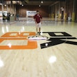
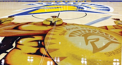
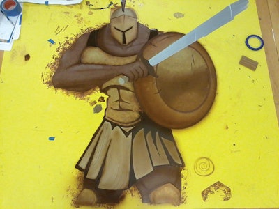
United Services Inc. in Idaho Falls, Idaho, has a long history of doing basketball floors, but they really put themselves on the map when they created the University of Oregon floor in 2010 (see the "Into the Woods" at the end of this article). They've done many tricky designs since then, but the most elaborate one was this San Jose State University Spartans floor.
The new floor design originated with the coach, who had previously been at Boise State, known for its bold branding, including its "Smurf Turf" blue football field and its basketball floor with huge bronco heads inside the three-point lines. The coach wanted the same kind of branding for his court at San Jose State.
"They said, 'We want these Spartans faux-painted on the floor,'" United Services' General Manager Shane Matheson says. "We had to figure out what that was! On top of that they picked these metallic paints—golds, coppers, silvers—that are impossible for anything to stick to."
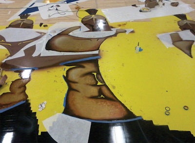
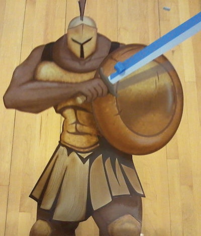
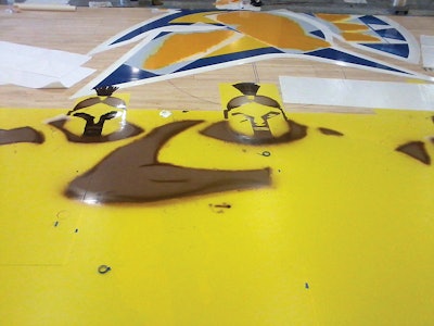
Once they had an image of the Spartans they liked, it was created in Adobe Illustrator. To convince the client they could actually create the design on a floor, United created an 8-foot sample. With that proof in hand and client approval, the outlines of the design were transferred to the plotter to create stencils—many, many stencils. The stencils are carefully adhered to the gym floor and have layers, so when one paint area is dry, a section can be removed and another area painted. This process can go on repeatedly depending on the complexity of the graphic.
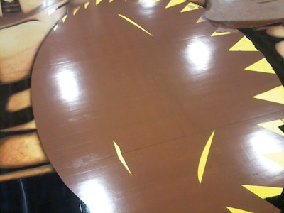
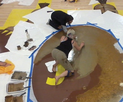 'Countless layers' of paint and transfer paper, along with three artists, were necessary to complete the Spartans graphics on the San Jose State University basketball floor.
The main Spartan graphic is 27 feet tall and 48 feet wide. The first stencil created the general outline of the Spartans for the base color. At that point three artists went to work on the graphic at the same time, using stencils along with faux painting techniques. "We put the base paint layers down, pull the vinyl up, then take transfer paper—what they use on top of vinyl—and put that on top of it and cut it," Matheson explains. "It was countless layers of paint and transfer paper and cutting by hand."
The client wanted the graphic to be perfect, and the artists on the floor, including United's Project Supervisor Nathan Banks, were perfectionists, too. When the desired effects—texture of the skin, cracks in the old pounded brass armor—in some small sections didn't look right, they sanded it off and started all over again.
Because the paints were metallic, they presented particular challenges. In addition to the fact that Matheson found "not only does it look like gold, it costs like gold," due to its composition, the appearance of the paint would change depending on direction of the brush strokes. So, the crew had to airbrush the metallic paints. Sometimes one of the artists would stand on a 16-foot ladder to direct the others during airbrushing so they could be sure to get the correct overall effect. They employed stippling techniques—using small dots—and also sprayed on highlights and shadows to make the floor pop.
Adhesion was always on their minds, Matheson says, adding that they knew the college would be taping a volleyball court over the Spartans graphic on a regular basis, so the crew was religious about making sure each paint and finish layer would be correctly bonded.
One of the biggest challenges was hand-abrading the entire graphic, Matheson says. ("I've seen guys spend hours hand-painting a logo and then run a buffer over it and ruin it," he says.) Then a sealer with "very good adhesion characteristics" was used to coat the graphic before the buffers abraded the rest of the floor.
"If you get close to them the details are incredible. You can see sweat, patina, cracks in the armor. When we were done they said, 'That is so much better than our expectations,'" Matheson says.

By comparison, the rest of the floor was easy. The large logo was painted—a routine process for them—and inside the three-point lines, the maple floor was stained. Although Matheson says the first time they ever stained a maple floor it turned out "nasty," by now they have their process—involving not sanding to too high of a grit, conditioning and water-popping the floor correctly—down to a science.
The university ships the court back to United every year to touch up and recoat, not risking damage to the floor that cost at least $250,000.
Pulling off a floor like this takes decades of accumulated experience, Matheson says. "It's a team effort to do it—all the way from the selling of it, to the design of it, to the execution and maintenance of it. It just takes a lot of people to do this, and everything has to fall in line."
Worst Mistake:
"When the Seattle SuperSonics moved to be the Oklahoma City Thunder, it was an elaborate floor. We shipped it out, and three days before the game, they put it down. Two days before the game they were certifying the floor and they called us and said the three-point line was 1 foot off. It was a brand-new arena, brand-new franchise. We were out there all night palm-sanding the three-point line off the floor. The finish dried hours before the game."
Tips:
• Be sure images clients want reproduced aren't copyrighted.
• Allow enough time for the whole project.
• Give paint extra cure time.
• Paint layers should be thin.
Into the Woods
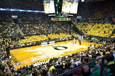
When people think of current trends in out-of-the-box basketball floor designs, many immediately think of the University of Oregon floor unveiled in 2010, which features a forest of fir trees surrounding center court. Designed by Nike designer Tinker Hatfield, the graphics were executed by United Services Inc., and General Manager Shane Matheson recalls when he was first flown in to Eugene, Ore., to meet with all the Oregon big names to see an initial design:
"On the wall they had hung a mockup for the floor. They said, 'This is our floor; can you do this?' I started to laugh. They said, 'What are you laughing about?' I said, 'It's completely doable, but it's going to cost a ton of money. Get a dump truck and back it up to the bank.'" Matheson says it took them about a month and a half to figure out how to execute the design—one unlike anything seen before. Almost two miles of stencil materials were used to create it. "It was a fantastic experience for us, because we learned we could do things people said were impossible. You either really love that floor or hate it, and that was their marketing strategy all along."
More photos of this United Services project:
Praters Athletic Flooring
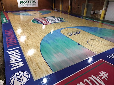 'We really pushed the limits of what paints and sealers can do with this one,' says Praters' Mark Frainie of the 2016 Women's ACC Championship court.
From its facility in Chattanooga, Tenn., Praters ships wild basketball floors all across the country. "Facilities don't get to sand their court down to bare wood very often. When they do, we encourage them to do something different, and we allow them to push the limits of court design by working with our design department. 'Whatever they want' is our attitude; let's make this particular facility a showplace," says President John Prater. "It doesn't matter whether it's the NCAA or a high school or the NBA, it's the same approach."
In the last couple years, the company has come to embrace the technique of using paint colors within their sealer coats, because the trend right now is for clients to want to see the grain of the floor. "That allows you to get any color of the rainbow, including colors that aren't traditional stain colors," Prater says. The technique also allows the company to match Pantone Matching System colors—a typical request for universities and schools particular about their branding—with the transparent look of a stain but without the need to use a traditional painted logo or other graphic. For earth tones, the company adds a concentrated dye in the sealer, and for other colors, paint is mixed with the sealer. "It gives us a lot more creative flexibility," Prater says.
It does require more work in doing samples, however. Matching a PMS color with paint is straightforward since the paint is opaque. Matching a PMS color in a sealer requires lots of sampling and back and forth to get approval, since the color of the natural wood becomes a factor, and typically the colors used must be darker than the end color to compensate for the lightness of the maple.
There's a fallback when using pigments in sealers, too. "If it's absolutely horrible, I can always paint over it," Prater says. Because it doesn't penetrate the wood like a stain does, it tends to not bleed as much, and if the client ends up not liking it, you can "buzz it off with a sander real quick," he adds.
Either way, the technique is not a good one for a typical residential contractor to use since any areas with more or less finish show the color darker or lighter. It works on these types of jobs because there are no start or stop marks—the sealer application starts and stops on the masked area, or is simply pulled straight wall to wall.
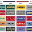
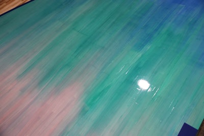
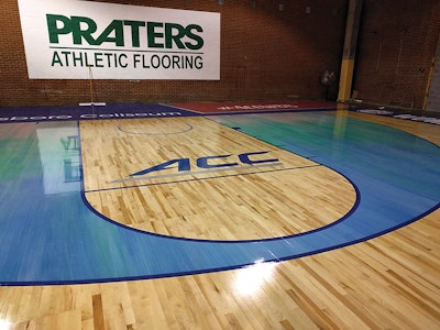
No example of this technique shows it off better than the elaborate 2016 Women's ACC Championship court. The ACC had a good idea of what they wanted for their design; it features large geometric shapes, with blended blue, green and pink shades across the three-point areas, "as if they were painted by a giant artist's hand," says Praters Creative Director Mark Frainie. "We really pushed the limits of what paints and sealers can do with this one, as well as the techniques used for application," adding that when they first got the design concept, they weren't sure how they would achieve it.
The initial process for the new portable floor was typical: It was assembled in Praters' facility and sanded, then coated with two coats of sealer. Then three-point lines were striped, and three colors of pigmented sealer were applied using an 18-inch T-bar with a nylon foam pad. During application, the T-bar was treated "as if it were a huge paintbrush," and all the color was applied at one time—so there was only one shot to get the colors right. And it had to be done quickly to keep the product workable. It was not for the faint of heart, says Prater. After the pigmenting, the logos and lettering were applied, buffed and the final coat(s) were applied. "At the end of the day, the floor looked just like the picture—which is always nice!" Prater says.
Tips:
• Make sure everything you need is available on site, from tools to applicators.
• Creating samples for customer approval is critical.
• Experiment with new techniques on panels at your shop until you can get them down correctly.
• Having a support team, from the office to on the floor, is critical to be able to pull off complicated designs.
Training:
For those interested in learning how to pull off complex basketball court designs, Praters doesn't keep its techniques a secret. In fact, its cool "The Edgegrain" blog on the company's website at pratersflooring.com has a series of "How it's Done" and "Tips & Tricks" videos showing how they do different techniques for their court designs. The company is also willing to act as a consultant. "We are partnering with more and more contractors around the country who are maybe hesitant to do a more complicated job. We provide anything from turnkey—we'll sand it and seal it and do the graphic application—to talking them through the design on the phone or sending one person out to the job to work on a project," John Prater says.
Recent Creative Projects
Ball Up Streetball:
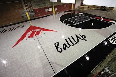
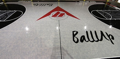
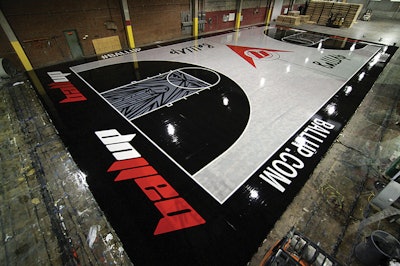
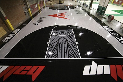
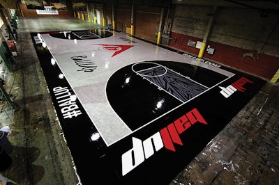
"This is one of the most challenging designs we have worked on. The main court features five shades of gray and is designed to mimic the pattern on a heather-gray T-shirt. Coming up with a process to create this look consistently over the entire court took months to figure out and weeks to execute," says Praters Creative Director Mark Frainie.
 Abby Mitchell
Texas Christian University:
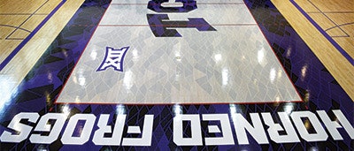
Praters worked with Ponder Company Inc. in Dallas to create this volleyball court. It and a matching basketball court are both based on TCU's frog-skin patterned uniforms. "There is so much detail that the task proved to be very labor-intensive and time-consuming," Frainie says. "The Ponder Company was able to allocate a tremendous amount of resources to this task, led by some really great and talented guys, to make quick work of it."
 Don Jedlovec, Santa Clara Athletics
Santa Clara University:
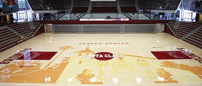
Designed by Tinker Hatfield, the Nike designer who also created the University of Oregon court, the floor features the university's architecture. Praters coordinated with San Carlos, Calif.-based H.Y. Floor & Gameline Painting Inc. on the floor, employing paint in sealer coats for the architectural design. "The flooring professionals at H.Y. Floor made the process of installing the stencil and applying the various colors for the mission a breeze," Frainie says.
More photos from these Praters projects:

Sportstech Flooring
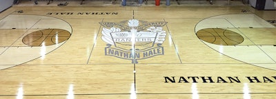 'You've just got to know what you're doing and be confident in what you're doing ... We've made mistakes; everybody does. It's part of the learning process,' says Andrew Ledford, project manager at Sportstech Flooring.
Complicated staining and dying jobs along with big graphics aren't just for NCAA and NBA floors. The trend has reached down to pre-collegiate levels, too, and companies like Sportstech Flooring in Tulsa, Okla., make their living specializing in gym floors in their region, handling all the design work, artwork and printing of stencils in-house. At Sportstech, "we probably do about 150 screen and coats per year and probably have 12 new floors going in this year," says Outside Salesperson Kathryn Gould.
The floor at Nathan Hale High School in Tulsa, Okla., (shown above) is a great example of how even high schools are taking a more modern approach with their basketball floors. The fixed maple floor was sanded and screened, and tape was laid down for the lines for the lanes and three-point arc. The lanes and basketball circles were premasked to leave only the three-point arc exposed. A white stain was mixed with sealer and applied to the three-point arc with a T-bar. After at least four hours of dry time, they peeled up the premasks in the key and premasked everything around the basketball circles, then coated those with sealer with a brown tint. The next day they peeled everything up, ran a maroon pad over all of it to knock down the grain and sealed the entire floor with two coats of sealer without any color.
Once the seal coats were dry, the floor was screened because "paint has to have something to stick to," says Sportstech Project Manager Andrew Ledford. This logo was relatively easy, he says, because it was only white and gray. "Whenever we do a stencil, painting the outline is first, and then we just work different colors one at a time," he explains. So the white was painted, and, once dry, the areas were cut out for the gray paint. Each color had at least two coats of paint. "After it's all set, you pull all the premask up and you have a single logo," Ledford says.
"If you don't do it a lot, it's easy to get lost in a logo," Ledford says. "You might pull the wrong color. If you're using paint, it's easier, because you can repaint with the right color. If it's stain, you're done for and you have to resand." Once the logo and lines were painted, the entire floor was abraded and the topcoats are applied for a completed floor.
Ledford says he is happy to see the trend toward using stains and tints that show the grain in the wood. "A while ago, every customer thought the more paint they had on the floor, the better it looked," he says. "But paint just sits on top, and you have to worry about scuff marks."
Tips:
• Follow directions about how much color you can add to the sealer to avoid peeling.
• Sealer coats with color must be applied carefully but fast enough that they don't start to set up and tear.
• Be prepared to do multiple coats of paint, particularly for some colors.
The Sports Authority
When it comes to maple sports flooring, the Maple Flooring Manufacturers Association Inc. is the authority. Formed in 1897, the MFMA publishes northern hard maple/beech/birch grade standards and floor care recommendations, and its PUR Standards use ASTM standards to define acceptability for shock absorption, vertical deflection, area of deflection, ball bounce and, for finishes, surface friction. Complete info on MFMA can be found at maplefloor.org.


