
Congratulations. You have just purchased ad space for your business in a local publication. Now all you've got to figure out is how to use it to generate sales and increase your business.
All too often, companies allocate resources for an advertising campaign—complete with a well-researched media buy—only to find their time and money wasted because their ad design falls flat.
These companies learn the hard way that crafting an effective ad involves much more than choosing a pretty picture and writing a bit of copy without any misspelled words. Time and again, clients come to my advertising firm for help after they've created their own ad campaign that "just didn't work." And time and again, we find that these companies have made the same critical errors in planning and designing their ads.
Fortunately, there's no need to learn by trial and error. Over the past few decades, my advertising firm has developed an internal process that it uses as the foundation for creating hundreds of ads for manufacturers and others in the building industry.
We've distilled this process into the key steps below that, if followed, will dramatically improve the quality of an ad's design and increase the chance of a strong response.
1) Strategy
Designing an effective ad should begin long before you start thinking about that perfect headline. When creating any ad campaign—whether it's for wood flooring installation or fluoride toothpaste—a company must determine how the ad fits with its overall marketing program and how the ad will reflect the company's brand.
Many successful advertisers opt to include consistent elements or themes in their ad designs.
Over time, these messages build and reinforce the company's brand difference in the mind of the target audience.
Still, each ad must have a specific purpose. Are you launching a new product? Touting a recent success? Seeking sales? In any event, a successful plan includes both a purpose and, when possible, a measurable goal.
At this point, you should also identify any "mandatories"—elements that must appear in the ad, like a Web address, a product name, a company logo and so on.
Advertisers skip this step at their peril. Strategic discussions help create a long-term approach to your advertising, and the decisions that emerge from this step will guide choices you make regarding the content and tone of your ad.
2) Define Your Target Audience
You probably already have a pretty good idea who your target audience is, right? Perhaps. But it's important not to make assumptions when creating an ad. There may be a broad target audience for your general business, but a more specific audience for a particular ad.
Gary Meyer, York, Pa.-based Baublitz Advertising's creative director and an award-winning designer, believes the most effective ads start with a clearly defined audience. "The more focus you can bring to your target audience, the better chance you have of designing an ad that touches that audience," Meyer says. "Conversely, the broader your target audience, the greater likelihood your message will become diluted—so broad that it doesn't grab anybody."
For example, if you design a flooring ad aimed at consumers, your message and imagery may address appearance and durability—features the end-user cares about. But an ad for the same product directed at builders might focus on ease of installation, taking the ad in a completely different creative direction. Can you create a single ad that successfully draws in both audiences? Perhaps. But it's a lot less likely.
3) Lead With Your Singular Strength
Your product or service has so many outstanding features; better include them all so every prospect knows just how great you are, right? Actually, it's better not to muddy the waters. Pick a key strength, and make it your primary focus.
"Clients make the mistake of thinking the general public is as interested in their product as they are," Meyer says. "The truth is, they're not. People skim ads, so you've got to build around a single concept that draws them in."
Meyer says the strongest ads usually focus on a specific "pain" experienced by the target audience, or on a compelling or unique feature. For example, a common pain builders experience involves late or incorrect deliveries. A distributor might reach this audience by basing its ad on a solution to that problem, or proof that it's an industry leader in on-time delivery.
Here's where some advertisers, wisely, draw on market research for guidance. Instead of guessing what will interest prospects, they ask customers and prospects directly, either through formal surveys or informal discussions. Often, we've found that our clients are surprised by some of the answers they get during this process.
Once you've selected your focal message, Meyer advises that you address it immediately in the headline and use as few words as possible to get your point across.
4) Create the Proper Tone
Choosing the right tone or "attitude" for your ad will enable you to connect to your target audience and make the ad more memorable. The right tone may be professional, playful, humorous, outrageous or subdued—it all depends on the decisions you've made up to this point in the process.
Are you trying to reach a conservative market that would be turned off by humorous copy? Is your reader familiar with industry jargon? If you are trying to reach consumers who are unfamiliar with your product, be sure to keep your copy simple—use easily understood terms to avoid confusing the prospect.
Once you've determined the right direction for the tone of your ad, craft copy that supports it.
The headline, of course, is all-important, but body copy or bullet points should also reflect the overall tone.
"Be concise," Meyer advises. "Your ad copy should do everything possible to make life easy on the reader. That means tight copy that's compelling, funny or intriguing, depending on your audience."
5) Choose the Right Visuals
By this point, you've got a solid foundation for your ad's content. Now, it's time to craft the "look" of the ad, which is critical to capturing the reader's eye on a crowded page.
The visual elements used to create an ad include images, graphics, color and layout (that is, the placement of all graphic elements and text).
These elements should be crafted to support the tone of your ad. For example, you might employ soft, subtle colors to create a soothing feel. For a more "in-your-face" attitude, use bright colors and images that pop.
"We base our selection of images and colors on the product, the audience and the desired action," Meyer says. "Again, that's why having a clear sense of a company's brand is so important in the design process."
How can you make your ad stand out? One of the biggest mistakes advertisers make is to crowd their ad with irrelevant visuals and type. A strong ad not only focuses on a single strength, but typically also makes use of a dominant image.
Don't forget the importance of white space, which is space without images or text that actually accentuates and highlights elements in the ad. Make life easy for your target audience. Make them want to look at your ad.
6) The Call to Action
You've designed an ad that your prospect will actually read. What's the next step? What should the prospect do now? Most ads include a call to action: Maybe you'd like them to call you for a free video, visit your Web site for more details, enter a drawing or call for a free sample. Whatever your company's call to action may be, it is critical that it fits with your overall marketing strategy.
7) Measurement
What does measurement have to do with design?
Well, this won't be the last ad you'll design. By finding some way to measure an ad's effectiveness, you'll have some guidance on what works the next time you sit down to craft an ad.
It can be difficult to link an ad directly to increased sales unless your ad includes a direct-response element. But often, you can measure an ad's impact via the call to action, for example, an upsurge in toll-free calls or Web visits following the publishing of your ad.
Once you've uncovered whether or not your ad "worked," do further market research to find out what inspired clients to react so you can repeat successes and avoid missteps in the future.
Getting a Return on Your Investment
Following the process outlined above has helped many advertisers focus on strategy and improve the overall effectiveness of their ad campaigns.
Make no mistake about it—advertising is an investment. By exerting as much control over the design process as possible, you have a greater chance to reap a better return on your advertising budget.
A final bit of advice that bears repeating: Whether you create your own ads or team with an agency for design and strategic guidance, make sure you take time to create a sound strategy before you begin to craft your design.
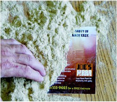
An Ad Redesigned

Here's an ad that had numerous strategic and design flaws. I have outlined just a few of the more flagrant problems:
Bad headline: These puns are not only cheesy, but they also fail to give the reader a clear-cut benefit—or any compelling reason to continue reading.
Too much information: An ad should be easy to read; this one makes the reader work way too hard. The design employs several fonts and pushes the copy in a few different angles. This ad also crams too much text into too little space. Not at all inviting.
Image problems: The graphic used in this ad was not only totally irrelevant (it looks like it could be a customer who was unhappy or needs more fiber in his diet—it's hard to tell), but the design also fails to include the company's logo—a big no-no.
Pity the poor reader who tries to discern anything clear from this ad and also the company that paid to run it.

The redesigned ad pulls over the bulleted features, but that's where the similarity ends:
Reaching the target audience: From working in this industry, we understand that today's consumer wants convenience in addition to quality. Our headline makes this the focus of our ad—you'll get a beautiful floor, and furthermore, we'll make it easy for you.
Imagery that supports strategy: We chose a single, simple, full-color image to command the entire area of the ad. This image reinforces the beauty and gives the consumer an image of the end product: This is what you get when you hire Joe's Wood Floors. The image also presented us with a key design advantage: the perfect background for the rest of our copy. Finally, we gave Joe's Wood Floors a logo and made it the only other image in the ad, making it more memorable to readers.
Easy on the eye: Note that we've retained plenty of white space here, drawing the reader's eye toward our ad and, more specifically, our headline. And, if someone wants to call Joe's, there's a clear call to action at the bottom of the ad.
We've used yellow text to make this "pop" a bit, so it's easy for the reader to find the contact information.
Common Blunders
When browsing through a publication, some ads grab your attention and pique your interest, and some just don't work. The ads in the latter category often make one or more of the five most common mistakes listed below. Avoid the following:
1 Too much copy. Avoid cluttering your ad with too much text. The average reader is only going to spend a few seconds glancing at your ad, so leave plenty of white space, focus on a great headline, and make it simple for the reader to grasp the key concept.
2 Too many typefaces. Too many fonts don't make an ad more sophisticated—just more confusing and difficult to read. Typically, you shouldn't use more than two or three typefaces when designing an ad.
3 Using clichés or cheesy wordplay. Think you've come up with a clever headline. Don't fall in love with it. A cliché or jokey headline won't work unless it succinctly relays your key message.
4 Presenting irrelevant features. Just because your company recently spent millions on a new piece of machinery doesn't mean it should be featured in the ad. Choose only visuals that help achieve the ad's goal.
5 Poor photography or imagery. Using unprofessional photography can make your ad look cheap and could actually damage—rather than enhance—your brand. If you can't afford high-quality images, it is best to allow copy and design elements to express your message.
Reputable Role Models
Here are examples of great ads that effectively convey their point and speak to their target audience with a just a few dominant words and images.


Brand Builders